We have been asked to create a media product that would engage a specific target audience through a variety of platforms. So here I aim to provide background information to our groups products detailing what kind of image we intended to create and our main goals behind creating the campaign. Also making sure to mention: research, narrative, use of colour, text, font, images, sound, mode of address and how they link across our brand.
The similarities between our two works (Main product and ancillary text) is the creation and presence of the scenery where the video was shot, instruments and tone. For the magazine advert, we intended to let the audience know that the video stood for suicidal with the text and themes we adapted in the digipak.

We explicitly chose the colour scheme to be black &gold; white so we could allow the leaf patches on the characters stand out. We believed this would show a good lyrical and visual relationship of death and oblivion as the album is called "Crash Love". Our aim was to make the ancillary products appeal from teen to young adult viewers. This is why we decided to edit the couple together with the night sky and willow grass background on the CD cover. The combination of these mise-en-scene devices would allow the audience to believe that there's some narrative involved with integrated themes such as romance,death and fantasy.

We decided to not present our artists (i.e. the videos characters) as the iconic cast for the both the normal cover and the special edition. To do this we decided to think of which suitable elements that the characters could be represented with. The song’s lyrics refer to many material but at the same time dreamy romantic themes so we decided that both characters should absence from the cover would clearly reflect the metaphoric nature of our work. This choice of mise-en-scene for the artists would prove to be accessible to an audience of a wider age range.
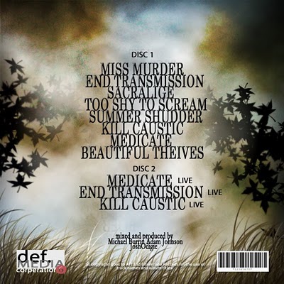
The back of our digipak also was presented in a similar context to the front CD cover because we aimed to have a scenery of consistency in the design, as you can see also we created a completely different production company to the one the actual band has, we did this to create a sense of originality in our work and also making sure we portrayed evidence of innovative efforts to the audience. We also aimed to reflect the style of many mainstream rock music project by making the CD pack a two disk edition,although AFI's actual album is a one disk version, we clearly intended on making sure there was a sharp difference in our presentation, the same applies for the video which carries the same context with the album cover with its style of shots and mise en scene,the project was shot in an abandoned warehouse with a derelict style portrayed by the make-up of the artists and the run-down style of the set.


No comments:
Post a Comment